Me-Page Team
Last modified 18 Aug 2026
Article Plan
- What Is a Call to Action?
- Why CTAs Matter for Business Websites
- Choose a CTA Based on Your Goal
- Make Your CTA Specific
- Use Action-Oriented Language
- CTA Design: Make Buttons Easy to Notice
- Place CTAs Where They Make Sense
- Use Different CTAs for Different Stages
- Don't Overload Visitors with CTAs
- Make CTAs Mobile-Friendly
- How ME-Page Helps You Create Effective CTAs
- Business Website Tips for Better CTAs
- Common CTA Mistakes
- Conclusion
- Frequently Asked Questions about Call-to-Action
A visitor lands on your website, reads your content, checks your services, and likes what they see. But what happens next?
If there's no clear direction, they may simply leave.
That's why a strong call-to-action is such an important part of a business website. A well-written CTA tells visitors what to do next, whether that's contacting your team, booking a service, buying a product, or signing up for updates.
The right call to action examples can inspire better ideas for your own website, while thoughtful CTA design can make those actions easier to notice and complete. Together, they can support better website conversion and create a smoother experience for potential customers.
What Is a Call to Action?
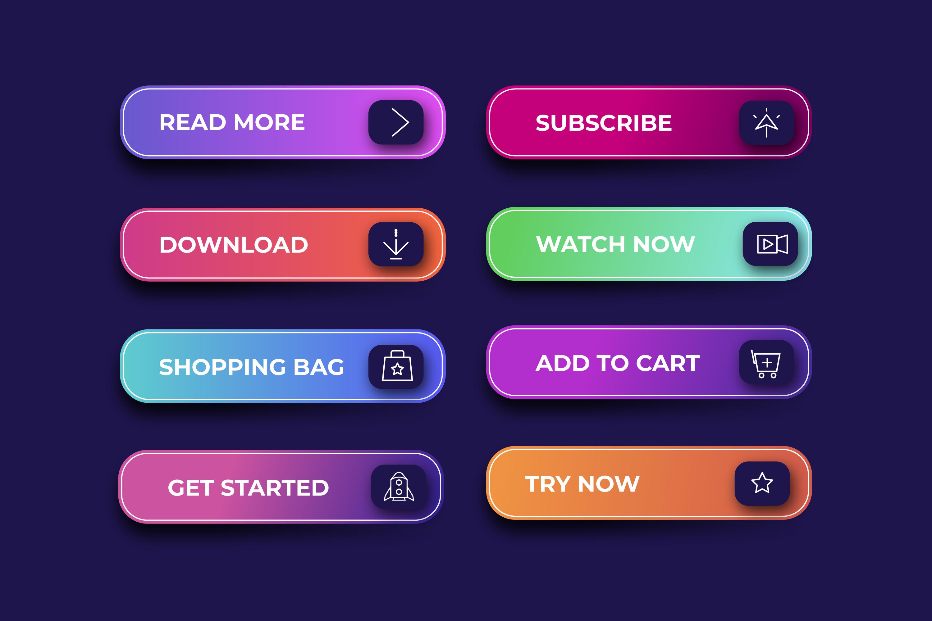
A call-to-action, or CTA, is a prompt that encourages a visitor to take a specific action.
Common examples include:
- Get Started
- Contact Us
- Book a Consultation
- Shop Now
- Request a Quote
- Download the Guide
- Schedule a Call
- Learn More
A CTA can appear as a button, text link, banner, or another interactive element.
The important thing is that the visitor understands what will happen when they click it.
Why CTAs Matter for Business Websites
Your website may provide excellent information, but information alone doesn't always generate results.
A CTA connects information with action.
For example, a service page can explain what your company does, but a "Request a Quote" button gives visitors a direct way to move forward.
Effective CTAs can help you:
- Generate leads
- Increase inquiries
- Encourage purchases
- Promote bookings
- Grow email lists
- Guide visitors through your website
This makes CTAs an important part of your overall website conversion strategy.

Choose a CTA Based on Your Goal
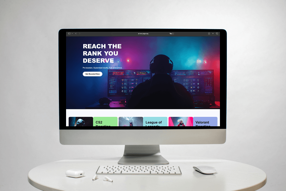
Before writing a button, decide what you want visitors to do. Your CTA should match the purpose of the page.
For Service Businesses
Good options include:
- Book a Consultation
- Request a Quote
- Get in Touch
- Discuss Your Project
- Schedule a Call
For example, a marketing agency could use "Request a Strategy Session" instead of a generic "Click Here."
For Online Stores
Ecommerce businesses can use:
- Shop Now
- Buy Now
- View Product
- Add to Cart
- Explore Collection
These CTAs tell shoppers exactly what they can do next.
For SaaS and Software Companies
Try:
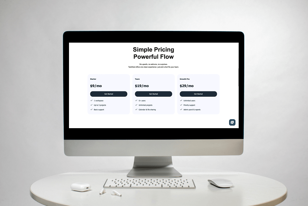
- Start Free Trial
- Create an Account
- Get Started
- See It in Action
- Request a Demo
The CTA should communicate the value of taking the next step.
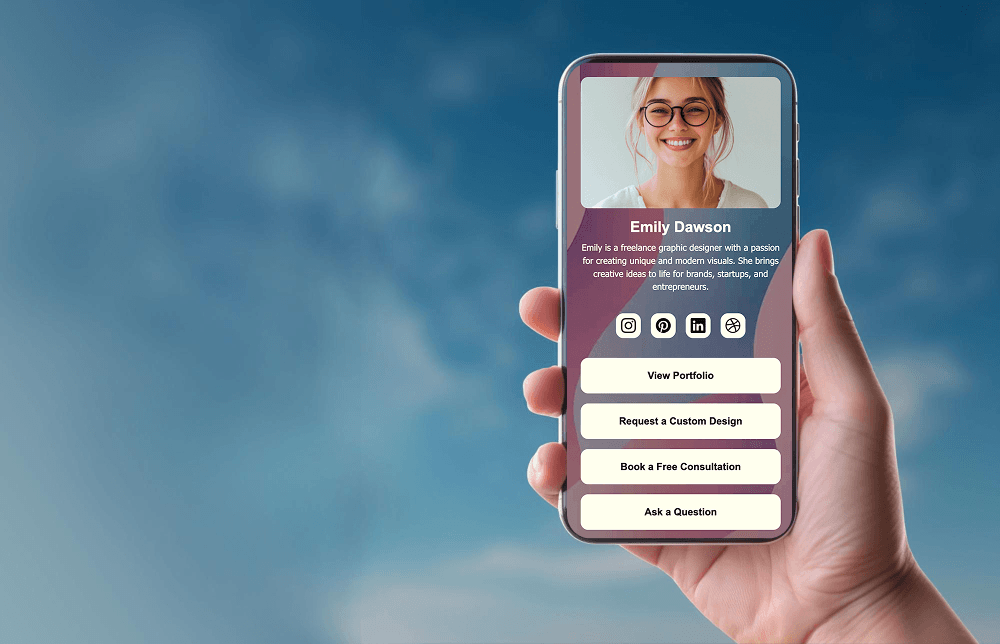
For Creators and Professionals
Useful options include:
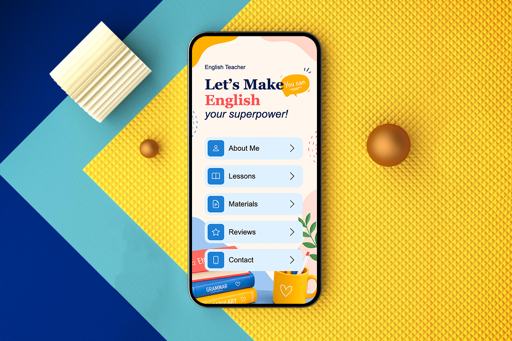
- View My Portfolio
- Work With Me
- Book a Session
- Explore My Work
- Contact Me
These CTAs work well for photographers, designers, consultants, coaches, and freelancers.
Make Your CTA Specific
One of the most common mistakes is using vague language.
"Click Here" doesn't tell visitors much.
Compare:
Click Here
with:
Book Your Free Consultation
The second option explains the action and gives visitors a reason to take it.
Specific CTAs reduce uncertainty and make your website easier to navigate.
Use Action-Oriented Language
Strong CTAs usually begin with an action.
Words such as:
- Get
- Start
- Book
- Download
- Explore
- Discover
- Join
- Contact
- Shop
make the desired action immediately clear.
Instead of "Consultation," try "Book a Consultation."
Instead of "Newsletter," try "Join Our Newsletter."
Small wording changes can make buttons more engaging.
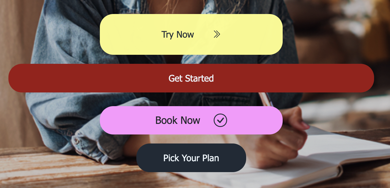
CTA Design: Make Buttons Easy to Notice
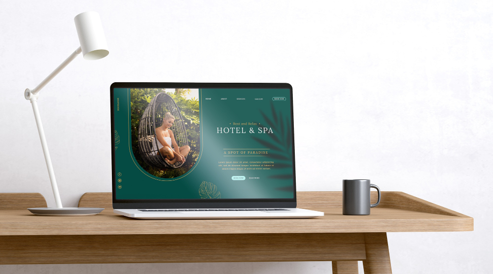
Good CTA design isn't about making every button huge and flashy.
Your CTA should stand out naturally from the surrounding content.
Consider:
- Strong contrast
- Readable text
- Adequate spacing
- Clear button shapes
- Consistent styling
For example, placing a CTA directly beneath a short explanation of your service can make the next step feel natural.
Place CTAs Where They Make Sense
Don't put every CTA at the bottom of the page.
Visitors may be ready to act earlier.
Consider adding CTAs:
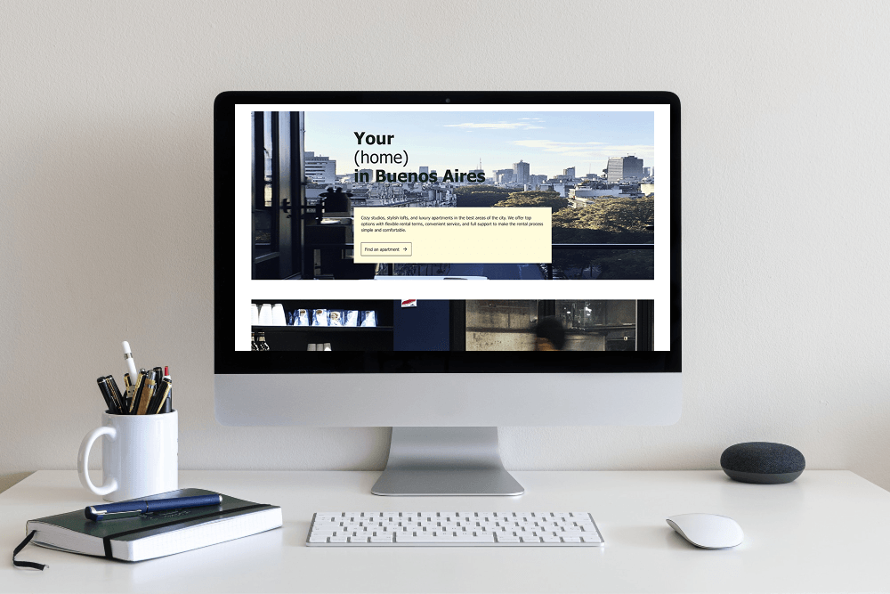
- In the hero section
- After explaining benefits
- Near pricing information
- After testimonials
- At the end of a service page
- In relevant blog posts
The CTA should appear when the visitor has enough information to make a decision.
Use Different CTAs for Different Stages
Not every visitor is ready to buy immediately.
Some may just be researching, while others are already comparing providers.
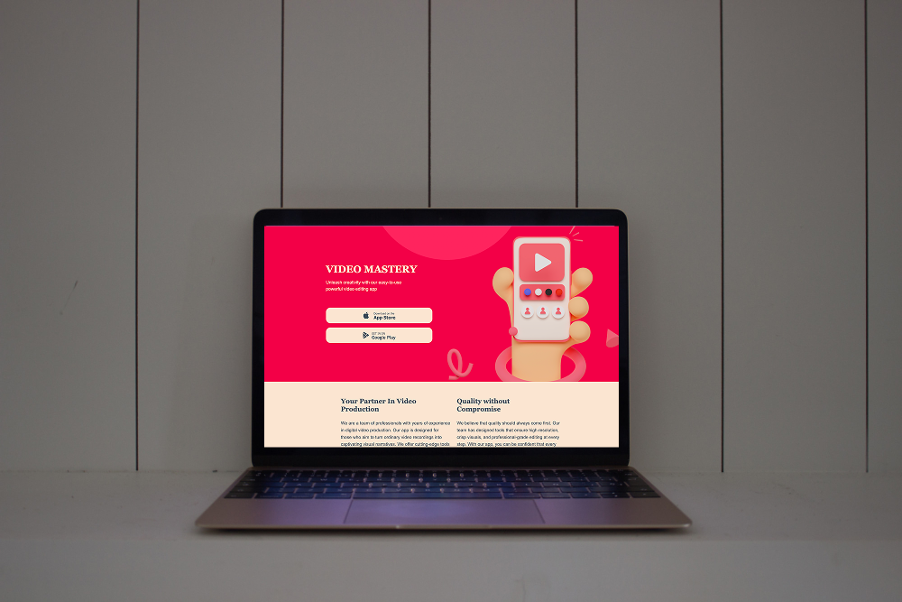
Use different CTA types based on their level of interest.
This approach helps visitors move through the buying journey without feeling pressured.
Don't Overload Visitors with CTAs
More buttons don't automatically mean more conversions. If every section has a different CTA, visitors may not know which action matters most.
Instead, choose one primary action for each page and use secondary CTAs only when they provide genuine value.
For example, a service page might focus primarily on "Book a Consultation" while using "View Our Portfolio" as a secondary option.
Make CTAs Mobile-Friendly
A CTA that looks great on a desktop may be difficult to use on a smartphone.
Check that your buttons:
- Are large enough to tap
- Have readable text
- Have enough space around them
- Don't sit too close to other links
- Work correctly on smaller screens
Mobile-friendly CTA design is especially important when visitors arrive from social media or mobile advertising.
How ME-Page Helps You Create Effective CTAs
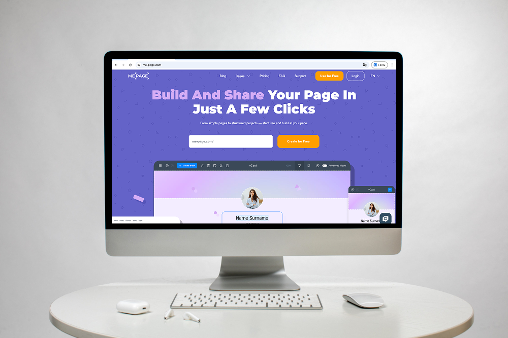
ME-Page makes it easy to add clear calls-to-action throughout your website.
You can use CTAs to guide visitors from your homepage to services, from service pages to contact information, or from content pages toward other relevant sections.
For example, a freelancer could create a homepage with a "View My Portfolio" button and follow it with a "Work With Me" CTA on the portfolio page.
This creates a logical journey instead of leaving visitors to figure out what to do next.
Business Website Tips for Better CTAs
Keep these business website tips in mind:
- Match every CTA to the page goal.
- Use specific action words.
- Communicate a clear benefit.
- Make buttons visually noticeable.
- Place CTAs near decision points.
- Keep the primary CTA consistent.
- Avoid unnecessary buttons.
- Test your CTAs on mobile.
- Review underperforming CTAs.
- Make sure every button actually works.
Even small changes to wording or placement can improve the way visitors interact with your website.
Common CTA Mistakes
Avoid these problems:
- Using "Click Here" everywhere
- Making buttons difficult to see
- Adding too many competing CTAs
- Using unclear language
- Hiding important CTAs below long sections
- Forgetting mobile optimization
- Sending visitors to irrelevant pages
- Promising benefits that aren't actually provided
A CTA should make the next step easier, not more confusing.

Conclusion
Effective calls-to-action turn passive website visitors into active users. The best call to action examples are clear, specific, and connected to a real visitor need. With thoughtful CTA design, strategic placement, and relevant messaging, businesses can create a smoother customer journey and support stronger website conversion.
Whether you're selling products, promoting services, collecting leads, or building an audience, every important page should give visitors a logical next step. With ME-Page, you can create organized pages and place clear CTAs throughout your website, helping visitors move naturally from discovering your business to taking action.
Frequently Asked Questions about Call-to-Action
Not necessarily. Important commercial pages usually benefit from a clear next step, but informational pages may simply guide visitors toward another useful resource or related piece of content.
Was This Article Helpful?
Click on a star to rate it!
Average Rating: 5/5
Voutes: 2
Share with Friends:



Previous
Why Your Business Needs a Dedicated Contact Page
Next
SEO Checklist Before Publishing Your Website
Recent Articles
Everything You Need to Know About Using ME-Page Constructor for Your Website.

Build a Personal Website That Stands Out in 2026
Your social media profiles can show what you do, but they do not give you complete control over your online pr...

Managing Multiple Websites from One ME-Page Account
Running more than one website used to be complicated. Different logins, scattered tools, and endless switching...
How to Organize Content Across Multiple Website Pages
A multi-page website gives you room to explain your business, services, products, and ideas without putting ev...

Essential Pages Every Business Website Should Include
A business website doesn't need dozens of pages to look professional. What it does need is a clear structure t...

How to Write Website Headlines That Attract More Visitors
A headline is often the first piece of text people notice when they open a website. Before they read your para...
How Freelancers Can Organize Services, Portfolio, and Contacts on...
Freelancers often wear many hats. One day you're working on a client project, the next you're answering inquir...
Build a Personal Website That Stands Out in 2026
Your social media profiles can show what you do, but they do not give you complete control over your online pr...
Managing Multiple Websites from One ME-Page Account
Running more than one website used to be complicated. Different logins, scattered tools, and endless switching...
How to Organize Content Across Multiple Website Pages
A multi-page website gives you room to explain your business, services, products, and ideas without putting ev...
Essential Pages Every Business Website Should Include
A business website doesn't need dozens of pages to look professional. What it does need is a clear structure t...
How to Write Website Headlines That Attract More Visitors
A headline is often the first piece of text people notice when they open a website. Before they read your para...
How Freelancers Can Organize Services, Portfolio, and Contacts on...
Freelancers often wear many hats. One day you're working on a client project, the next you're answering inquir...