Mobile Website Builder — Edit Pages on Any Device
Take full control of your web presence wherever you go with an advanced mobile website builder. Customize layouts, tweak content, and launch responsive pages directly from your smartphone or tablet. Whether you need a mobile landing page builder or want to create a website for free on mobile, deliver a pixel-perfect mobile experience effortlessly.
No credit card required • Free forever plan available

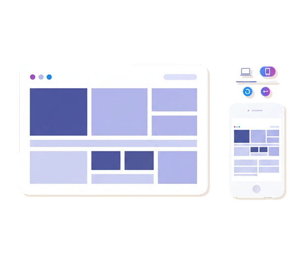
Edit Your Site on Any Device
Watch how simple it is to adjust font sizes, hide/show specific blocks on mobile vs. desktop, and preview touch navigation in real time.
Why Choose Our Mobile Site Builder
Discover how our mobile-first technology gives you the freedom to create, edit, and optimize your website on any screen size.
Build & Edit Directly on Your Phone
Enjoy a seamless website builder on phone interface. Tweak text, upload media, and publish updates on the go without sitting at a desktop computer.
Independent Mobile View Customization
Fine-tune mobile spacing, adjust font sizes, or hide heavy desktop sections to ensure your mobile friendly website builder output is clean and easy to scroll.
Google Mobile-First Indexing Ready
Boost search rankings automatically. Over 60% of web traffic comes from smartphones, and our mobile first website builder guarantees search engines index your site favorably.
Touch-Optimized Form & Shop Widgets
Integrate mobile-friendly forms, click-to-call buttons, and quick checkout steps tailored for tap-and-swipe smartphone navigation.
How to Build Website on Phone in 3 Simple Steps

Choose a Responsive Mobile Template
Pick a pre-designed layout optimized for smaller screens in our free mobile site builder.
Customize Content for Small Screens
Adjust font scale, align media, configure mobile forms, and toggle element visibility for mobile vs. desktop viewports.

Publish & Rank Higher
Hit publish to launch your responsive site instantly, fully optimized for fast loading speeds and touch navigation.
Explore Mobile-Optimized Templates for Every Industry
Pick pre-configured responsive designs engineered for high performance on touchscreens.
Mobile E-Commerce Stores
Touch-friendly product cards, mobile cart drawers, and instant payment links
Creator Portfolios & Link-in-Bio
High-impact vertical galleries and social action buttons designed for mobile feeds
Local Business & Service Sites
Click-to-call headers, tap-to-map directions, and mobile appointment forms
Mobile App & Promo Pages
App store badges, feature highlights, and lead capture pop-ups
62%+
Web Traffic Comes from Mobile Devices
100%
Google Mobile-First Indexing Compliance
< 1.2s
Average Mobile Page Loading Speed
"Being able to edit my online store directly from my smartphone changed everything. I can update product prices and launch promo banners in minutes while traveling!"
- Elena K., Small Business Owner
Supercharge Your Mobile Site with More Features
Combine mobile editing with comprehensive website building tools.
Structure (Drag & Drop)
Arrange mobile blocks effortlessly using touch-friendly visual controls.
Buttons (Actions)
Add tap-to-call, instant message, and mobile payment buttons.
Pages & Subpages
Organize complex content into clean mobile drop-down menus and collapsible drawers.
Instant Updates
Save and publish mobile changes live in real time with zero server delay.
Analytics
Monitor smartphone vs. desktop visitor traffic and conversion rates.
The Essential Mobile Website Builder for Modern Search and Traffic
In today's digital ecosystem, having a web presence that performs flawlessly on smartphones is no longer optional—it is a core business necessity. With over 60% of global web traffic originating from mobile devices, Google heavily prioritizes mobile-first indexing when ranking websites. Utilizing a dedicated mobile website builder ensures that your site delivers exceptional speed, intuitive navigation, and flawless visual presentation across every screen size. Whether you need an easy mobile website builder or want to manage your entire online presence on the go, Me-Page empowers you to build and edit responsive pages effortlessly.
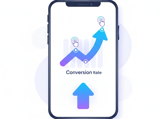
Why a Mobile-First Approach Drives Higher Conversions
A common mistake in traditional web design is treating mobile optimization as an afterthought, leading to tiny text, broken buttons, and frustrating horizontal scrolling. A specialized mobile first website builder flips this paradigm by prioritizing mobile user experience from the ground up:
-
Touch-Friendly Interface Elements: Ensure all buttons, links, and form fields are sized appropriately for tap and swipe gestures.
-
Device-Specific Customization: Tweak font sizes, adjust image spacing, or hide heavy desktop media blocks specifically for mobile viewports using a flexible mobile page builder.
-
Streamlined Mobile Navigation: Replace cluttered desktop header menus with clean, collapsible navigation drawers that keep users engaged.
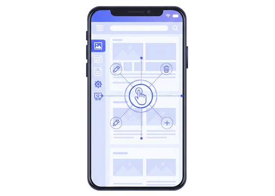
Edit and Launch Your Website Directly from Your Smartphone
You shouldn't be tethered to a desktop computer to make urgent updates to your online store or personal portfolio. Me-Page functions as an intuitive website builder on phone, enabling you to manage your site from anywhere:
-
On-the-Go Content Management: Easily create free website from phone browsers, update product listings, or edit contact info while away from your desk.
-
Dedicated Mobile Landing Pages: Utilize a powerful mobile landing page builder to launch targeted ad campaigns, event signups, or social media bio hubs in minutes.
-
Automated Technical Optimization: Our mobile responsive website builder engine dynamically scales images, minifies mobile scripts, and ensures lightning-fast page loading speeds.
Scale Your Reach with a Free Mobile Website Maker
Building an accessible, search-engine-friendly web presence should be fast and affordable. By taking advantage of our free mobile website builder, you can test different mobile layouts, optimize touch navigation paths, and make website mobile friendly without technical obstacles or coding costs. Discover the freedom of a true codeless mobile site creator and reach your audience wherever they are.
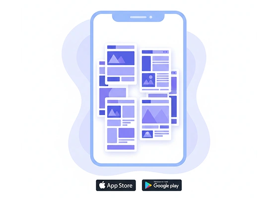

Scale Your Web Presence Without Code Constraints
Whether you need a full business portal or want to discover how to make website with multiple pages for a niche content hub, Me-Page equips you with professional-grade architecture tools. Simplify site management, reuse design assets, and scale your digital brand effortlessly.
From simple free html page builders to multi-layered site structures, experience true creative freedom and craft professional, pixel-perfect site designs without writing code, all powered by Me-Page's flexible visual editor.
Start Building on MobileFrequently Asked Questions About Mobile Website Building

Ready to Build a Mobile-Ready Site in Minutes?
Reach users wherever they are with Me-Page's mobile website creator.
Create Your Free Mobile Site NowExplore Helpful Guides & Resources

Getting Started with ME-Page Ready-Made Blocks: A Step-by-Step Wa...
ME-Page offers an easy and intuitive drag-and-drop editor that helps beginners build a fully functional websit...
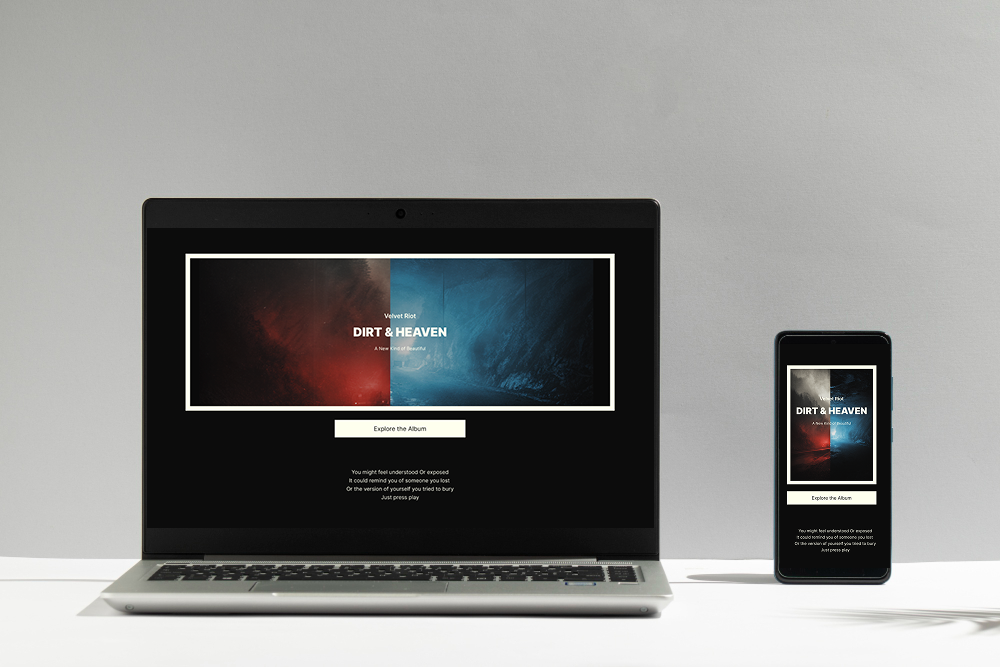
Top 7 Website Design Trends in 2025 You Can Apply with ME-Page
The digital world evolves faster than we can blink. Just when you think you’ve nailed a sleek design, a new tr...

Website Builder vs Custom Development: Why ME-Page Wins
When it comes to creating a website in 2026, businesses face a familiar question: should you use a website bui...