Me-Page Team
Last modified 13 Oct 2026
Article Plan
- Why Does Your Website Footer Matter?
- What Should You Include in a Website Footer?
- How to Organize Footer Links for Better Navigation
- Footer Design Elements: What Works Best?
- Make Your Footer Work on Mobile Devices
- Common Website Footer Mistakes to Avoid
- How ME-Page Helps You Create a User-Friendly Website
- Conclusion
- Frequently Asked Questions
A website footer might be the last thing visitors see, but that doesn't make it unimportant. When people reach the bottom of a page, they may still be looking for contact details, pricing information, social media profiles, or answers to common questions. A well-designed website footer helps them find what they need without scrolling back to the top or searching through multiple pages.
Good footer design also supports website navigation, builds trust, and makes a website feel complete. Whether you're creating a personal portfolio, a business website, or a landing page, a useful footer can improve the overall website UX.
Let's explore what to include in your footer and how to make it work for your visitors.
Why Does Your Website Footer Matter?
Think of your footer as a final navigation point. Visitors who reach it may be ready to take the next step, or they may simply need additional information before making a decision.
A clear website footer gives them another way to explore your content. For example, someone browsing your services might use footer links to check your pricing, read your policies, or contact your team.
A well-planned footer can help you:
- Improve navigation: Give visitors quick access to important pages.
- Build trust: Display contact information, legal pages, and social profiles.
- Support conversions: Direct visitors to booking forms, product pages, or contact options.
- Create consistency: Maintain a familiar navigation experience across your website.
- Reduce frustration: Make essential information easy to find.
However, adding every possible link isn't the answer. An overloaded footer can be just as confusing as one that contains almost nothing.
What Should You Include in a Website Footer?
The right footer content depends on your website's purpose. A freelancer's portfolio doesn't need the same links as an online store or a company website. Start with the information your visitors are most likely to need.
1. Essential Website Navigation Links
Include links to your most important pages, especially those visitors might want to access from anywhere on your website.
Common choices include Home, About, Services, Pricing, Blog, and Contact. If your website has several subpages, group related links under clear headings instead of displaying one long list.
For example, a service business might organize its footer into three sections: Services, Company, and Get in Touch. This structure helps visitors understand where each link leads.
2. Contact Information
Make it easy for people to reach you. Depending on your business, your footer might include an email address, phone number, business address, or a link to a contact form.
You don't need to display every detail if it isn't relevant. A freelance designer, for instance, may only need an email link and a professional social profile. A local business might benefit from including its address and opening hours.

3. Legal and Privacy Links
Privacy policies, terms of service, and other relevant legal information are often placed in the footer because visitors may need them from any page.
These links are particularly important for businesses that collect personal information through contact forms, subscriptions, or other website features. Keep their labels clear so users know what to expect before clicking.
4. Social Media Links
If your brand is active on social media, include links to the platforms you actually use. These links can help visitors explore your work, follow updates, or learn more about your business.
Use recognizable icons with accessible labels. Avoid filling the footer with inactive profiles or every social network available. A few relevant links are more useful than a long row of icons.
5. A Clear Call to Action
Sometimes, visitors reach the bottom of a page because they're interested but haven't decided what to do next. A simple call to action (CTA) can guide them.
Depending on your goals, this could be a “Contact Us” button, a link to book a consultation, or an invitation to explore your services. Make sure the action matches the page's purpose and leads to the correct destination.
A good footer design makes information easy to scan. Visitors shouldn't have to read every link to understand where to go.
Use these practical principles:
- Group related links. Put company information, services, and support resources in separate sections.
- Choose descriptive labels. Use “View Pricing” instead of a vague label like “More.”
- Keep the hierarchy simple. Give important links greater visibility than secondary resources.
- Use consistent wording. If your main navigation says “Services,” don't rename the same section “What We Do” in the footer without a clear reason.
- Avoid unnecessary duplication. Repeating essential links is useful, but copying your entire navigation menu may create clutter.
The goal is to make website navigation easier, not to turn the footer into a second sitemap containing every page on your website.
Footer Design Elements: What Works Best?
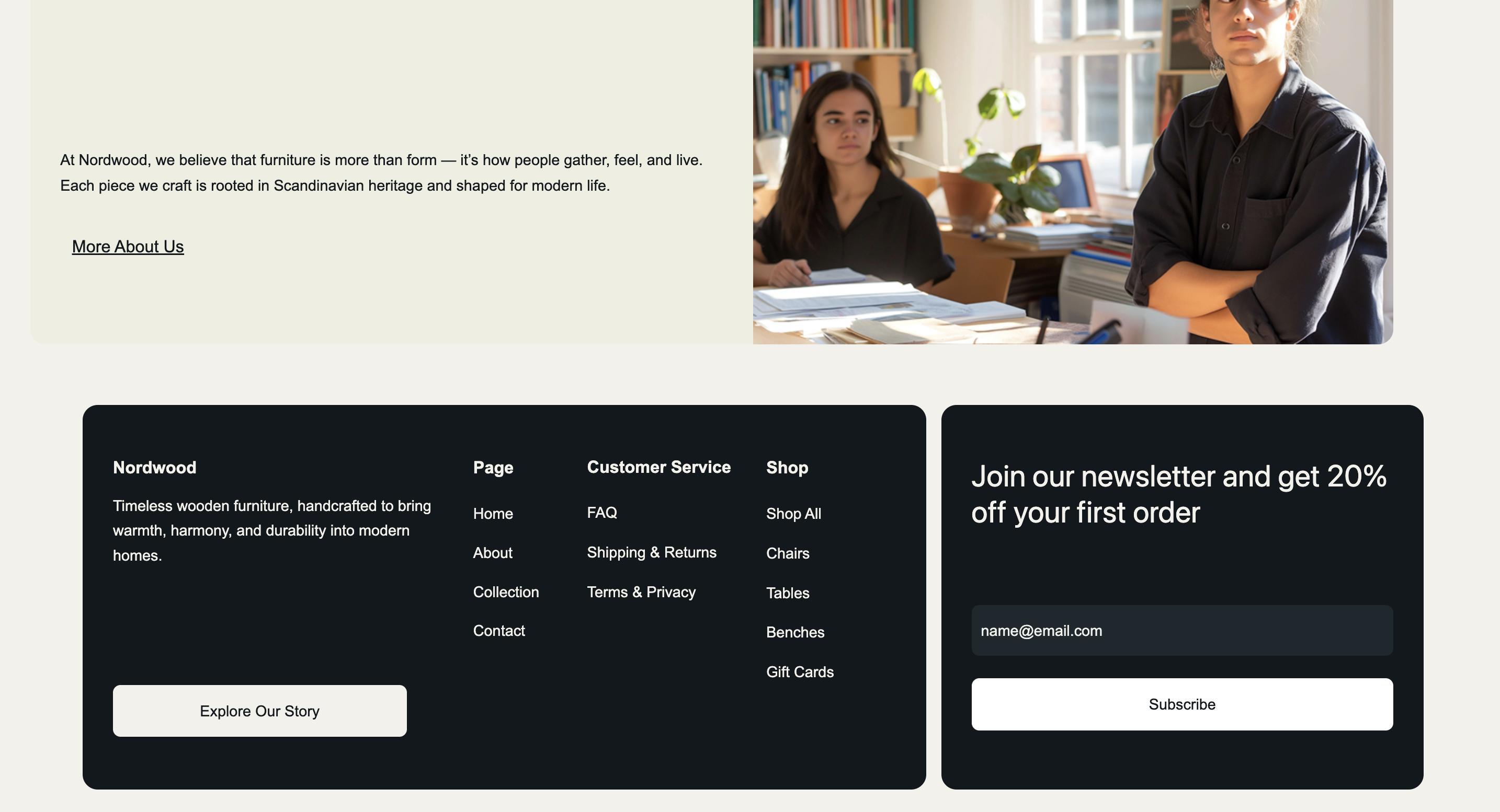
Your footer's visual appearance affects how easily visitors can use it. Even useful information becomes frustrating when the text is too small, the spacing is poor, or links are difficult to distinguish.
Keep the design consistent with the rest of your website. A footer doesn't need elaborate graphics or complex animations to look professional. Clear structure, readable text, and thoughtful spacing usually do more for website UX.
Many visitors browse websites on smartphones, so your footer needs to work well on smaller screens. A layout that looks organized on a desktop can become crowded when several columns are squeezed into a narrow display.
Use a responsive layout that adjusts to the available space. Stack link groups vertically, keep text readable, and provide enough distance between clickable elements.
Also, check how the footer behaves when users zoom in or navigate with a keyboard. Make sure links remain accessible and aren't hidden behind overlapping elements.
Before publishing, test your footer on different screen sizes. Open the website on a phone, tap every important link, and check whether users can reach contact information and other key pages without difficulty.
Even a visually attractive footer can create problems if its content or functionality isn't carefully planned.
Watch out for these common mistakes:
- Adding too many links: Too many choices make it harder to find the most important pages.
- Using vague labels: Visitors shouldn't have to guess what a link means.
- Ignoring mobile users: Tiny text and tightly packed links are frustrating on touchscreens.
- Forgetting to update content: Outdated phone numbers, broken links, and old social profiles damage trust.
- Making the footer difficult to read: Low contrast and small fonts reduce usability.
- Relying only on icons: Unlabeled icons may confuse visitors or be difficult for assistive technologies to interpret.
Review your footer whenever you add pages, change contact details, or update your website structure. A quick check can prevent small problems from affecting the entire browsing experience.

How ME-Page Helps You Create a User-Friendly Website
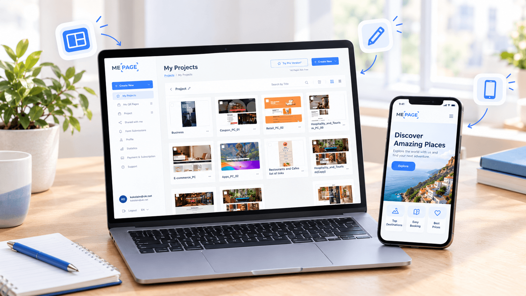
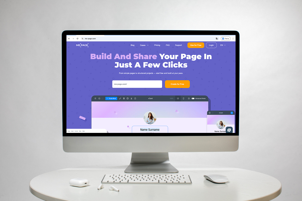
With ME-Page, you can build a website without writing code. Its drag-and-drop builder lets you arrange page elements and create a layout that fits your content and brand.
For a website with multiple pages, the Multi Page Builder helps you organize pages and subpages into a clear structure. Reusable sections can also make it easier to maintain a consistent appearance across your site.
You can use custom action buttons to direct visitors toward important destinations, such as a contact page or service page. The Mobile Website Builder lets you manage your website from a smartphone or tablet, helping you make updates wherever you are.
When designing your footer, focus on the links visitors need most and make sure each one leads to the right place. ME-Page gives you a practical way to build and maintain your website while keeping usability in mind.
Conclusion
A good website footer does more than fill the bottom of a page. It gives visitors a reliable way to navigate your content, find contact details, review important policies, and take the next step.
Start with essential footer links, organize them into logical groups, and use readable typography and clear visual styling. Then test the design on desktop and mobile devices to make sure everything works as expected.
Remember, effective footer design isn't about adding more elements. It's about making the right information easy to find. With a thoughtful approach to website navigation, you can create a better website UX and give visitors a smoother experience from the top of the page to the bottom.
Frequently Asked Questions
Most websites benefit from having a footer because it provides a consistent place for secondary navigation and essential information. Even a simple landing page can use a footer for contact details, privacy information, or social links.
Was This Article Helpful?
Click on a star to rate it!
Average Rating: 5/5
Voutes: 2
Share with Friends:


Previous
How to Link Pages Together for Better Website Navigation

Next
Welcome to ME-Page: Your Ultimate Website Constructor
Recent Articles
Everything You Need to Know About Using ME-Page Constructor for Your Website.
How to Design a Website Footer That Improves User Experience
A website footer might be the last thing visitors see, but that doesn't make it unimportant. When people reach...
How to Link Pages Together for Better Website Navigation
A multi-page website gives you more room to organize information, but adding pages is only half the job. Visit...

Build a Personal Website That Stands Out in 2026
Your social media profiles can show what you do, but they do not give you complete control over your online pr...

Managing Multiple Websites from One ME-Page Account
Running more than one website used to be complicated. Different logins, scattered tools, and endless switching...
How to Organize Content Across Multiple Website Pages
A multi-page website gives you room to explain your business, services, products, and ideas without putting ev...

Essential Pages Every Business Website Should Include
A business website doesn't need dozens of pages to look professional. What it does need is a clear structure t...
How to Design a Website Footer That Improves User Experience
A website footer might be the last thing visitors see, but that doesn't make it unimportant. When people reach...
How to Link Pages Together for Better Website Navigation
A multi-page website gives you more room to organize information, but adding pages is only half the job. Visit...
Build a Personal Website That Stands Out in 2026
Your social media profiles can show what you do, but they do not give you complete control over your online pr...
Managing Multiple Websites from One ME-Page Account
Running more than one website used to be complicated. Different logins, scattered tools, and endless switching...
How to Organize Content Across Multiple Website Pages
A multi-page website gives you room to explain your business, services, products, and ideas without putting ev...
Essential Pages Every Business Website Should Include
A business website doesn't need dozens of pages to look professional. What it does need is a clear structure t...