Me-Page Team
Last modified 7 Apr 2026
Article Plan
- What Is Mobile-First Design?
- Why Mobile-First Design Matters
- Key Principles of Mobile-First Design
- How to Build a Mobile-First Website with ME-Page
- Mobile-First vs Traditional Design
- Common Mistakes to Avoid
- Real-Life Benefits
- Conclusion
- Frequently Asked Questions about Design a Mobile-First Website
If your website doesn’t look great on a smartphone, you’re already losing visitors. Today, most users browse on mobile devices first, which is why mobile-first design is no longer optional.
The good news? You don’t need advanced skills to build a mobile-optimized site. With tools like ME-Page, you can create a modern, responsive website quickly and efficiently.
Let’s explore how to do it the right way.
What Is Mobile-First Design?
Mobile-first design means creating your website for small screens first, then scaling it up for larger devices like tablets and desktops.
Instead of shrinking a desktop site, you:
- Start with mobile layout
- Focus on essential content
- Add features progressively
This approach ensures your site works perfectly where it matters most, on mobile.
Why Mobile-First Design Matters
1. Most Users Are on Mobile
A large percentage of web traffic comes from smartphones. If your site isn’t optimized for mobile, users will leave quickly.
Mobile users also expect instant access to information without delays or friction. If your website feels slow or difficult to navigate, they are likely to switch to a competitor within seconds. Prioritizing mobile-first design ensures you capture and retain this growing audience effectively.
2. Better User Experience
Mobile-first websites are:
- Easier to navigate
- Faster to load
- More focused
This improves engagement and keeps visitors on your site longer.
3. Improved SEO Performance
Search engines prioritize mobile-friendly websites. Using a responsive website builder helps ensure your site meets modern ranking requirements.
Mobile-first design also improves page speed, which is a critical ranking factor. Additionally, it reduces bounce rates by delivering a better user experience, signaling to search engines that your content is valuable and relevant. Over time, this can lead to higher visibility and more consistent organic traffic.

Key Principles of Mobile-First Design

1. Keep It Simple
Small screens require clarity.
Focus on:
- Short text blocks
- Clear headings
- Minimal distractions
2. Prioritize Content
Show only what matters most.
Ask:
- What does the user need first?
- What action should they take?
Everything else can come later.
3. Use Touch-Friendly Design
Mobile users interact with their fingers, not a mouse.
Make sure:
- Buttons are large enough
- Links are easy to tap
- Spacing prevents misclicks
4. Optimize Loading Speed
Mobile users expect fast performance.
Reduce:
- Heavy images
- Unnecessary animations
- Large scripts

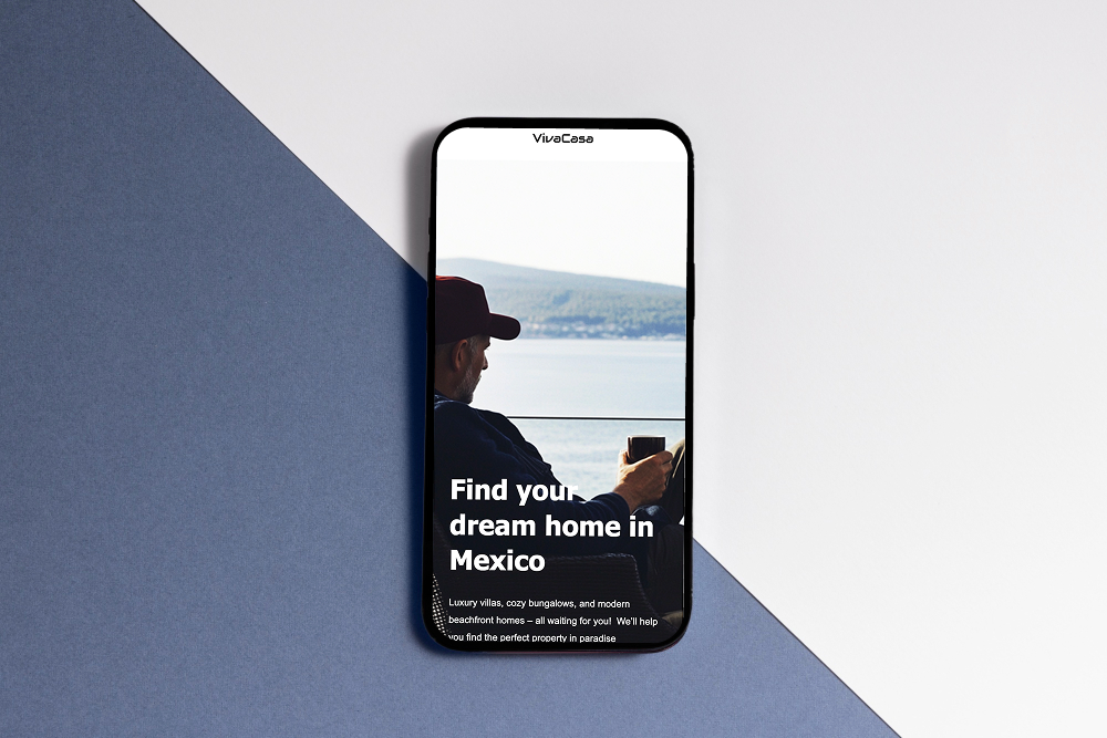
How to Build a Mobile-First Website with ME-Page
1. Start with a Mobile Layout
Using ME-Page, begin by selecting a clean layout designed for mobile screens.
This helps you:
- Focus on structure first
- Avoid clutter
- Build a strong foundation
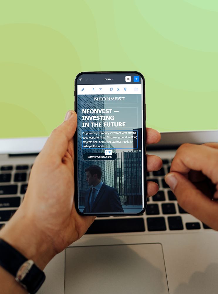
2. Use a Responsive Website Builder
A responsive website builder automatically adjusts your design for different screen sizes.
With ME-Page, your site will:
- Adapt to mobile, tablet, and desktop
- Maintain consistent design
- Ensure usability across devices
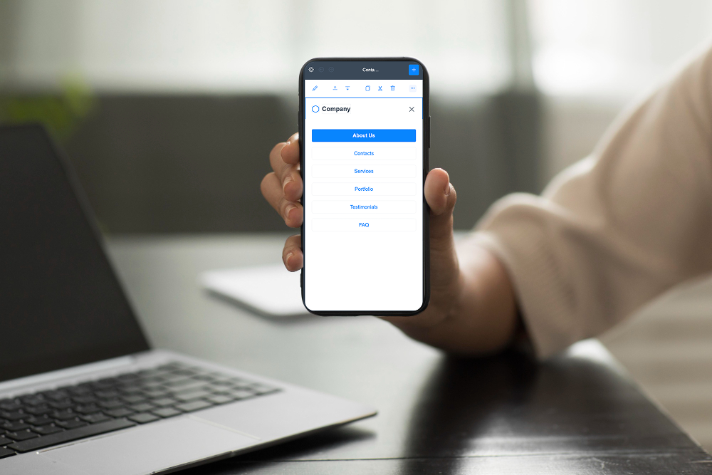
3. Design in Sections
Break your page into simple, scrollable sections.
For example:
- Hero section
- About section
- Services
- Call-to-action
This makes navigation smooth and intuitive on mobile devices.
4. Optimize Typography
Text should be easy to read without zooming.
Tips:
- Use clear fonts
- Keep font sizes large enough
- Maintain good spacing
5. Test Across Devices
Even with a responsive website builder, testing is essential.
Check:
- Different screen sizes
- Button functionality
- Load speed
Make adjustments as needed.

Mobile-First vs Traditional Design
Common Mistakes to Avoid
- Designing for desktop first
- Using small buttons or links
- Overloading pages with content
- Ignoring performance optimization
Mobile-first design is about clarity and usability, not just resizing elements.
Real-Life Benefits
Higher Engagement: Users stay longer on mobile-friendly sites.
Better Conversions: Clear layouts guide users toward action.
Improved Rankings: Search engines favor mobile-optimized websites.
Future-Proof Design: Your site stays relevant as mobile usage grows.

Conclusion
Designing for mobile first is one of the smartest decisions you can make for your website. It ensures your content is accessible, fast, and user-friendly from the start.
By using mobile-first design and a reliable responsive website builder, you can create a site that performs well across all devices.
With ME-Page, the process becomes simple and efficient. You don’t need technical expertise, just a clear vision and the right tools.
Start with mobile, keep it simple, and build a website that truly works for today’s users.
Frequently Asked Questions about Design a Mobile-First Website
The main advantage is improved user experience on mobile devices, where most traffic comes from today. It ensures your website is fast, easy to navigate, and focused on essential content. This approach also helps improve SEO rankings and engagement.
Yes, a responsive website builder is still essential because it ensures your site adapts properly to larger screens. Mobile-first design focuses on starting small, while responsiveness ensures consistency across all devices. Both work together for the best results.
ME-Page provides tools and layouts that are already optimized for mobile use. It allows you to design visually and ensures your site remains responsive across devices. This makes the entire process faster and easier.
Yes, but it may require restructuring your layout and content. You’ll need to simplify your design, prioritize key elements, and optimize performance. Using a platform like ME-Page can make this transition much smoother.
Was This Article Helpful?
Click on a star to rate it!
Average Rating: 5/5
Voutes: 1
Share with Friends:
Previous
From Idea to Website: How ME-Page Simplifies Website Creation

Next
How Fast Websites Improve SEO and User Experience
Recent Articles
Everything You Need to Know About Using ME-Page Constructor for Your Website.
Using Subpages to Build Service, Pricing, and About Pages
As your website grows, placing all your information on a single page becomes less effective. Visitors want to ...

Why Every Artist Needs a Website Beyond Social Media
For artists, musicians, photographers, illustrators, and other creatives, social media has become an important...

Selling Digital Products with ME-Page: What You Need
The digital economy has opened countless opportunities for creators, freelancers, educators, and entrepreneurs...
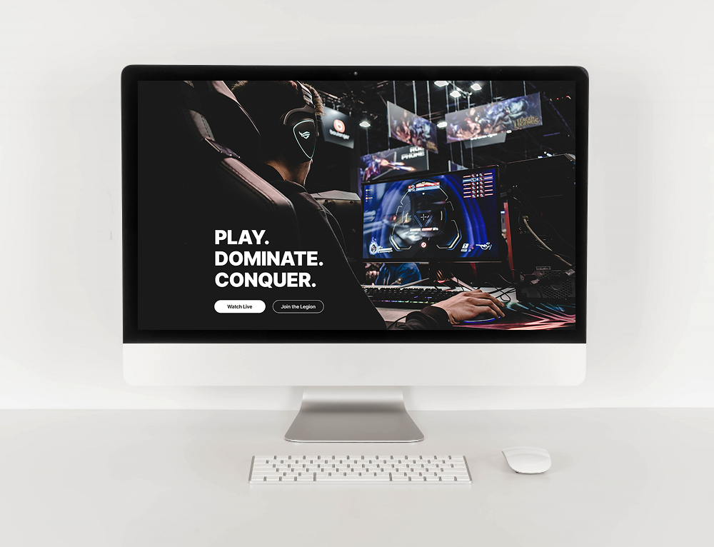
Community Websites for Gamers: Features That Matter
Gaming is no longer just about playing—it’s about connecting with people who share the same interests. Whether...

How Community Projects Use ME-Page to Grow Awareness
Community initiatives, local organizations, volunteer groups, and nonprofit projects often face the same chall...

How Startups Launch MVP Websites with ME-Page
For startups, speed is everything. Before investing heavily in development, design, or marketing, founders nee...
Using Subpages to Build Service, Pricing, and About Pages
As your website grows, placing all your information on a single page becomes less effective. Visitors want to ...
Why Every Artist Needs a Website Beyond Social Media
For artists, musicians, photographers, illustrators, and other creatives, social media has become an important...
Selling Digital Products with ME-Page: What You Need
The digital economy has opened countless opportunities for creators, freelancers, educators, and entrepreneurs...
Community Websites for Gamers: Features That Matter
Gaming is no longer just about playing—it’s about connecting with people who share the same interests. Whether...
How Community Projects Use ME-Page to Grow Awareness
Community initiatives, local organizations, volunteer groups, and nonprofit projects often face the same chall...
How Startups Launch MVP Websites with ME-Page
For startups, speed is everything. Before investing heavily in development, design, or marketing, founders nee...