Me-Page Team
Last modified 18 Jun 2026
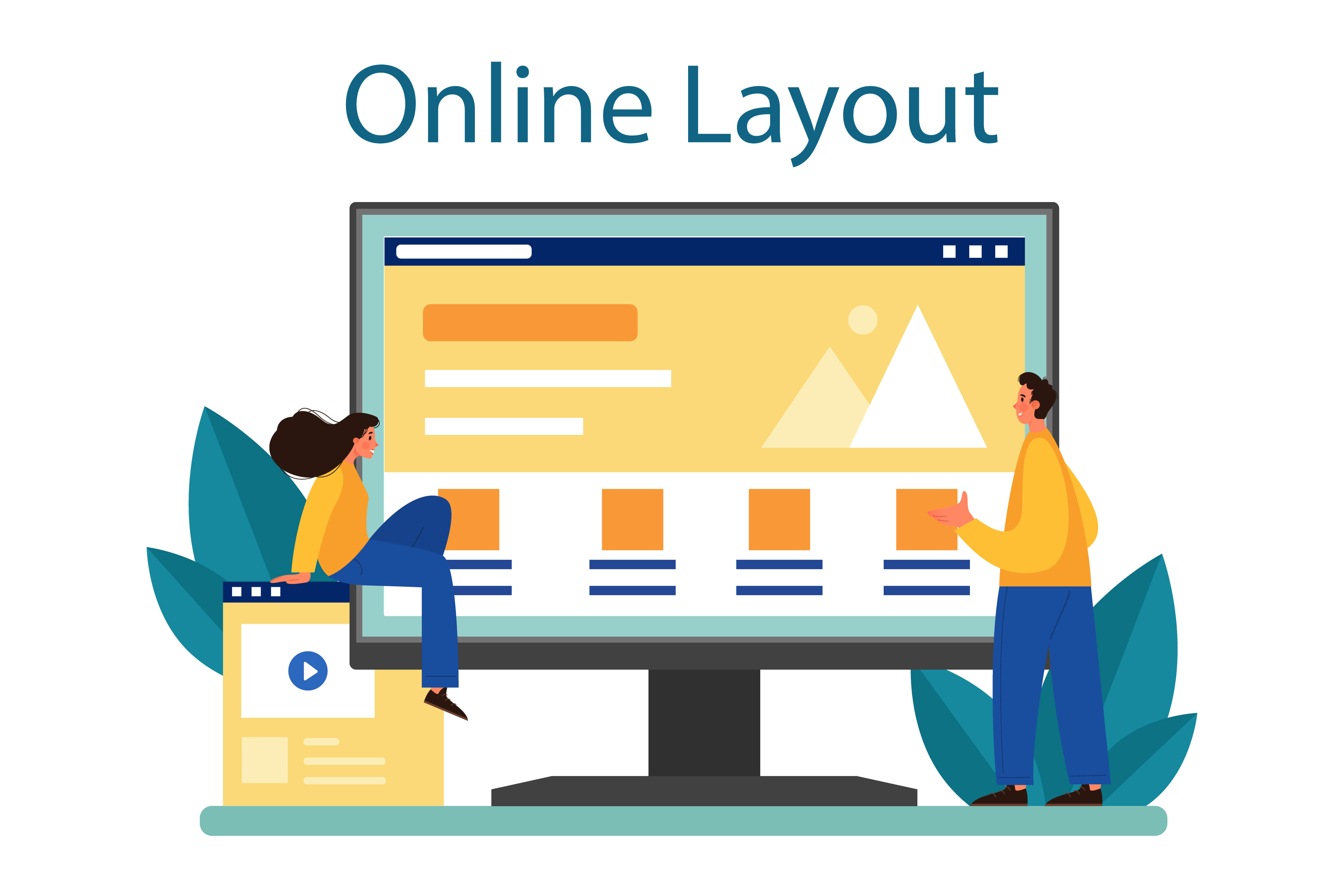
Article Plan
- Why Navigation Matters
- Start with a Clear Menu Structure
- Keep Navigation Simple
- Design for User Behavior
- Navigation Best Practices at a Glance
- Optimize Navigation for Mobile Devices
- How Website Navigation Supports SEO
- How ME-Page Helps Create Better Navigation
- Common Navigation Mistakes to Avoid
- Conclusion
- Frequently Asked Questions about Designing Navigation Menus
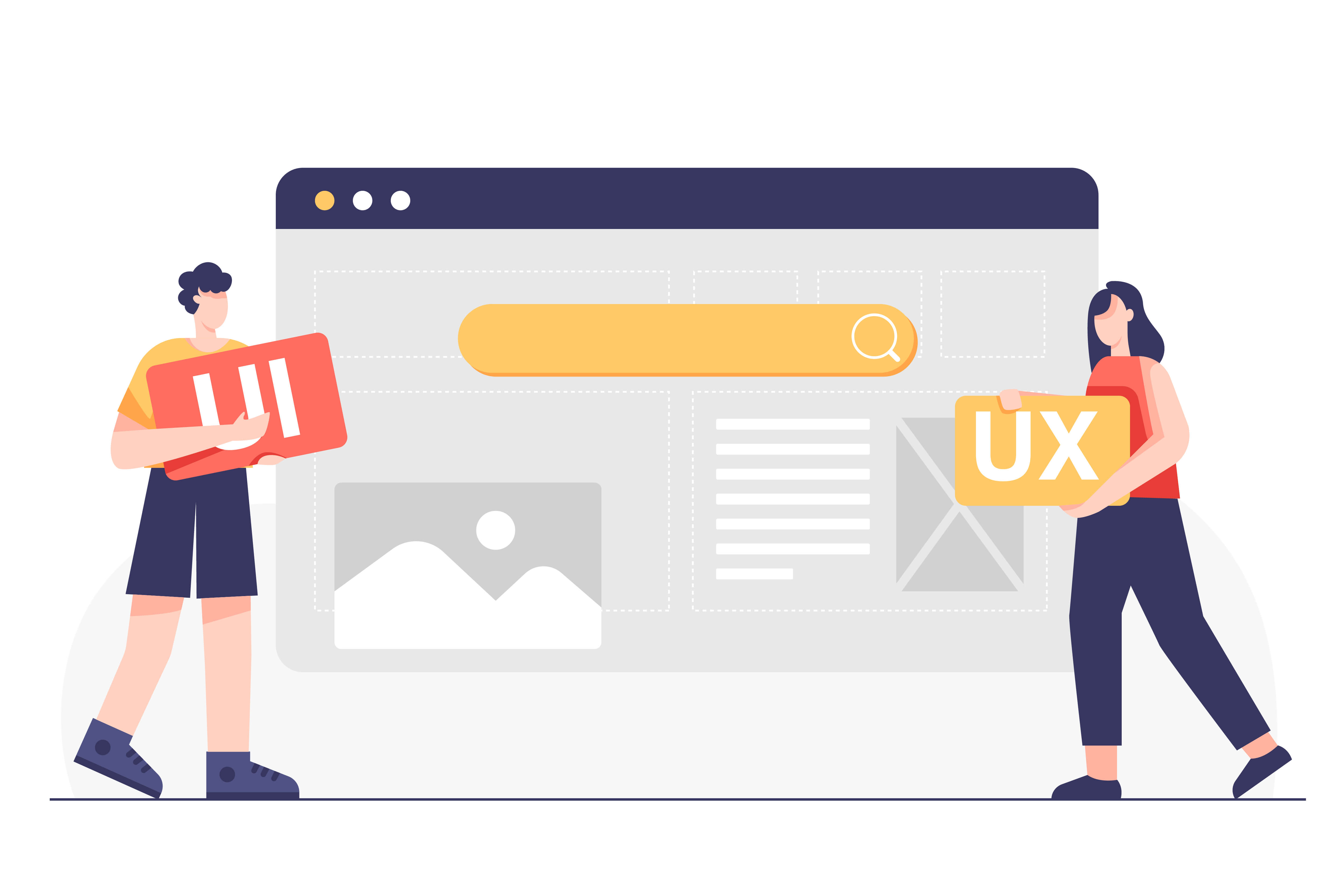
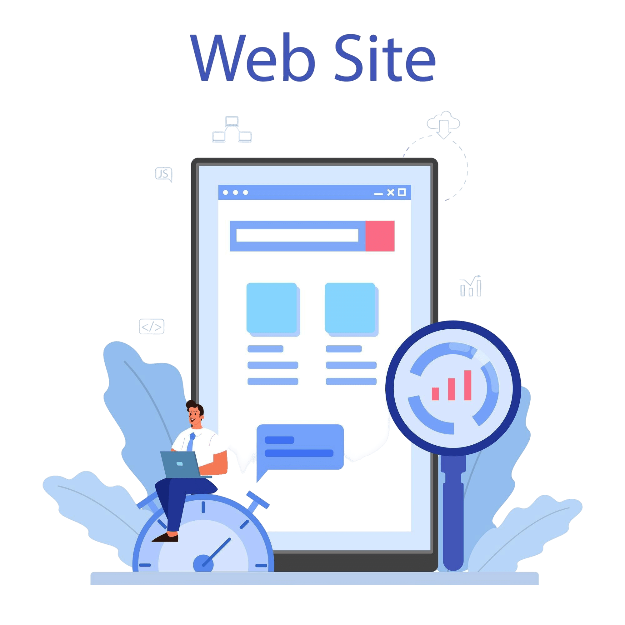
A website can have great content, beautiful visuals, and valuable services—but if visitors can’t find what they’re looking for, none of that matters. That’s why effective website navigation design is one of the most important aspects of building a successful multi-page website.
Navigation acts as a roadmap, helping users move through your site with confidence. A well-planned menu structure improves usability, supports SEO, and creates a smoother UX navigation experience.
Whether you're building a business website, portfolio, online store, or educational platform, thoughtful navigation can significantly improve engagement and conversions.
Let’s explore the best practices for designing navigation menus that actually help users.
Why Navigation Matters
Navigation is often the first interaction users have with your website.
Good navigation helps visitors:
- Find information quickly
- Explore more pages
- Stay engaged longer
- Complete desired actions
- Build confidence in your brand
For example, a visitor looking for pricing information should be able to find it within seconds. If they struggle to navigate your website, they may leave before taking action.
Strong website navigation design reduces friction and improves the overall user experience.
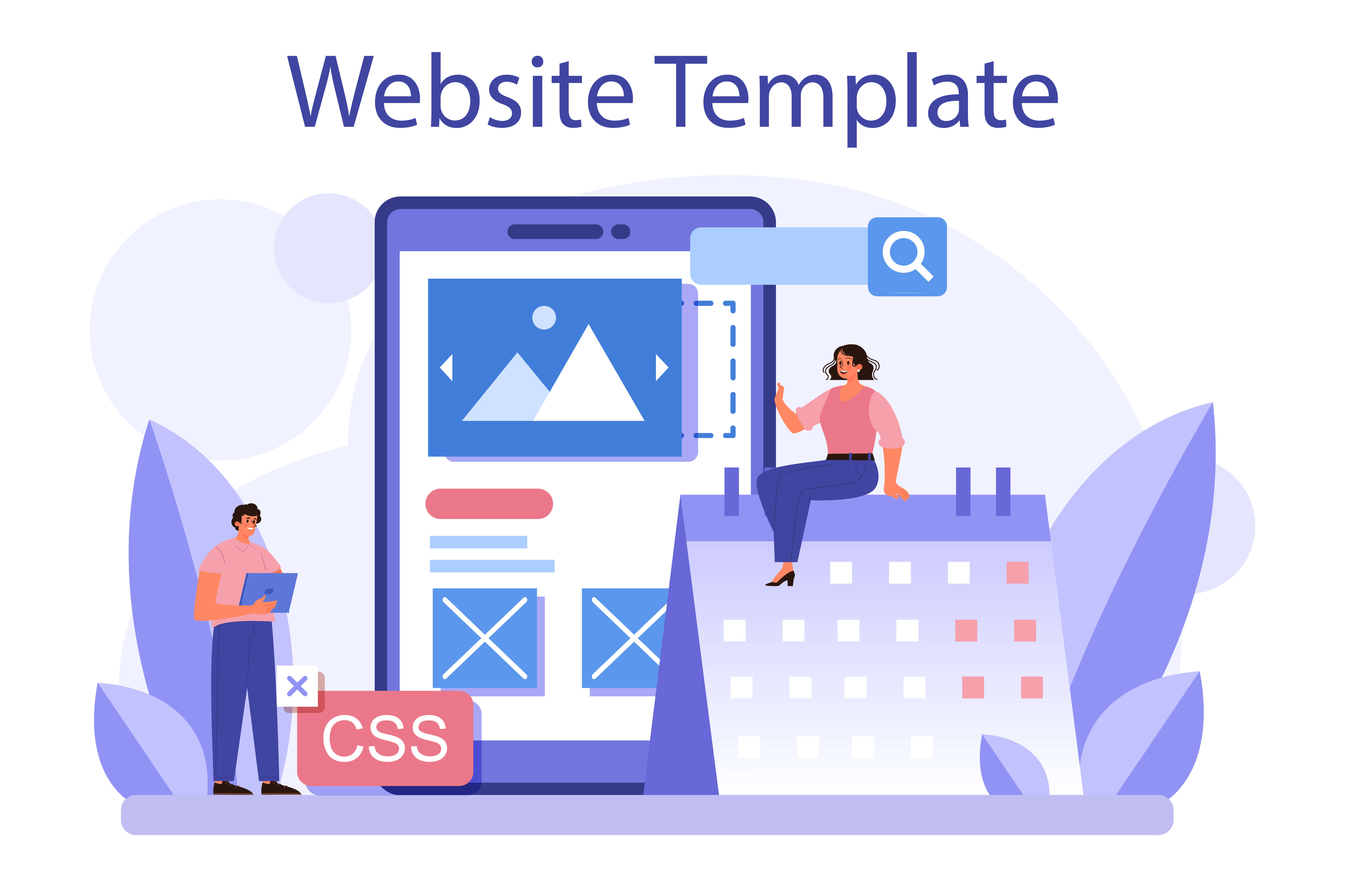
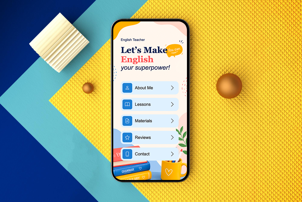
Start with a Clear Menu Structure
A good menu structure should be simple, logical, and easy to understand.
Organize Pages by Category
Group related content together under clear categories. For example, a business website might separate Services, About, Resources, and Contact into distinct menu items. This helps visitors understand your website at a glance.
Prioritize Important Pages
Not every page deserves a spot in the main navigation. Focus on the pages users are most likely to need. For instance, a service-based business should make Services and Contact easily accessible. Important pages should never be hidden behind multiple clicks.
Use Familiar Labels
Avoid creative menu names that confuse visitors. Labels like "About," "Pricing," and "Contact" are immediately recognizable. Clear terminology improves usability and reduces decision-making effort.
Keep Navigation Simple
One of the biggest mistakes in UX navigation is overcomplicating menus.
Limit Main Menu Items
Too many choices can overwhelm visitors. Most websites perform best with a manageable number of primary navigation links. For example, five to seven top-level menu items often provide enough flexibility without creating clutter.
Avoid Deep Navigation Layers
If users need to click through multiple levels of menus, they may become frustrated. Try to keep important content accessible within a few clicks whenever possible.
Reduce Visual Clutter
Navigation should support the user journey, not distract from it. Clean layouts make menus easier to scan and use.
Design for User Behavior
Effective navigation should reflect how visitors actually browse websites.
Think About User Goals
Ask yourself what visitors are trying to accomplish. For example, a potential client may want service information, while a returning customer may need support resources. Understanding user intent helps create a more intuitive navigation system.
Use Predictable Placement
Most users expect navigation menus at the top of a page or within a mobile menu icon. Familiar placement reduces confusion and improves usability.
Highlight Key Actions
Calls-to-action such as "Book a Consultation" or "Get Started" can be included in navigation menus to encourage conversions. Making these actions visible improves accessibility and engagement.
Navigation Best Practices at a Glance
Following these principles creates a stronger menu structure and a more user-friendly experience.
Optimize Navigation for Mobile Devices
A large percentage of website traffic now comes from smartphones and tablets.
- Use Responsive Menus: Navigation should automatically adapt to smaller screens. Mobile-friendly menus make browsing easier and improve usability across devices.
- Keep Touch Interactions Simple: Buttons and menu items should be easy to tap without accidental clicks. Proper spacing improves the mobile experience significantly.
- Prioritize Essential Links: Mobile users often want quick access to important information. Focus on key pages rather than overwhelming visitors with too many options.
How Website Navigation Supports SEO
Navigation doesn't only help users—it also helps search engines.
- Improves Crawlability: A clear navigation system helps search engines discover and understand website pages more efficiently. Better organization can improve indexing and visibility.
- Strengthens Internal Linking: Navigation menus create important internal links between pages. These connections help distribute authority throughout your website and improve SEO performance.
- Supports Content Hierarchy: A logical menu structure helps search engines understand relationships between pages and sections. This contributes to a stronger overall website architecture.

How ME-Page Helps Create Better Navigation
ME-Page makes it easier to build organized, user-friendly websites.
- Flexible Multi-Page Structures: Users can create and manage multiple pages while maintaining a clear navigation hierarchy. This supports both simple websites and more complex projects.
- Custom Menu Organization: Businesses can structure navigation around their audience's needs rather than forcing content into rigid templates. This flexibility improves usability and visitor engagement.
- Mobile-Friendly Experience: ME-Page supports responsive layouts that ensure menus remain accessible across devices. Consistent navigation helps visitors browse comfortably regardless of screen size.
- Easy Updates: As websites grow, navigation often needs adjustments. ME-Page allows users to update menus and page structures quickly without major redesigns.
Common Navigation Mistakes to Avoid
Many websites unintentionally create friction through poor navigation choices.
Avoid:
- Overcrowded menus
- Confusing page labels
- Too many dropdown levels
- Hidden important pages
- Inconsistent navigation across pages
- Ignoring mobile usability
Simple and intuitive navigation usually performs best.

Conclusion
Effective website navigation design is about helping visitors find what they need with as little effort as possible. A thoughtful menu structure improves usability, supports SEO, and creates a better overall UX navigation experience.
By organizing content logically, prioritizing important pages, and optimizing for both desktop and mobile users, businesses can create websites that feel intuitive and professional. Platforms like ME-Page make it easier to build and manage navigation systems that scale alongside your website.
The easier it is for visitors to navigate your site, the more likely they are to stay engaged, explore your content, and take action.
Frequently Asked Questions about Designing Navigation Menus
Website navigation design refers to the structure and organization of menus and links that help users move through a website.
Was This Article Helpful?
Click on a star to rate it!
Average Rating: 5/5
Voutes: 1
Share with Friends:

Previous
How Website Updates Work on ME-Page (No Downtime Explained)

Next
Welcome to ME-Page: Your Ultimate Website Constructor
Recent Articles
Everything You Need to Know About Using ME-Page Constructor for Your Website.

Designing Navigation Menus for Multi-Page Websites
A website can have great content, beautiful visuals, and valuable services—but if visitors can’t find what the...
How Website Updates Work on ME-Page (No Downtime Explained)
Keeping a website updated is essential for staying relevant online. Whether you're changing content, launching...

ME-Page vs Link-in-Bio Tools: What’s the Difference?
For creators, freelancers, entrepreneurs, and businesses, having a single destination for online visitors has ...

Event Landing Pages That Drive Registrations
Planning an event is only half the challenge—the other half is getting people to register. Whether you're host...
How Coaches and Educators Build Authority Websites
In a crowded online world, expertise alone is no longer enough. Coaches, consultants, trainers, and educators ...

Website Analytics for Beginners: What Metrics Matter
Launching a website is exciting, but how do you know if it’s actually working? Are visitors finding your conte...
Designing Navigation Menus for Multi-Page Websites
A website can have great content, beautiful visuals, and valuable services—but if visitors can’t find what the...
How Website Updates Work on ME-Page (No Downtime Explained)
Keeping a website updated is essential for staying relevant online. Whether you're changing content, launching...
ME-Page vs Link-in-Bio Tools: What’s the Difference?
For creators, freelancers, entrepreneurs, and businesses, having a single destination for online visitors has ...
Event Landing Pages That Drive Registrations
Planning an event is only half the challenge—the other half is getting people to register. Whether you're host...
How Coaches and Educators Build Authority Websites
In a crowded online world, expertise alone is no longer enough. Coaches, consultants, trainers, and educators ...
Website Analytics for Beginners: What Metrics Matter
Launching a website is exciting, but how do you know if it’s actually working? Are visitors finding your conte...