
Website Builder Tips & Guides
Practical articles on building websites, landing pages, and growing your online presence.
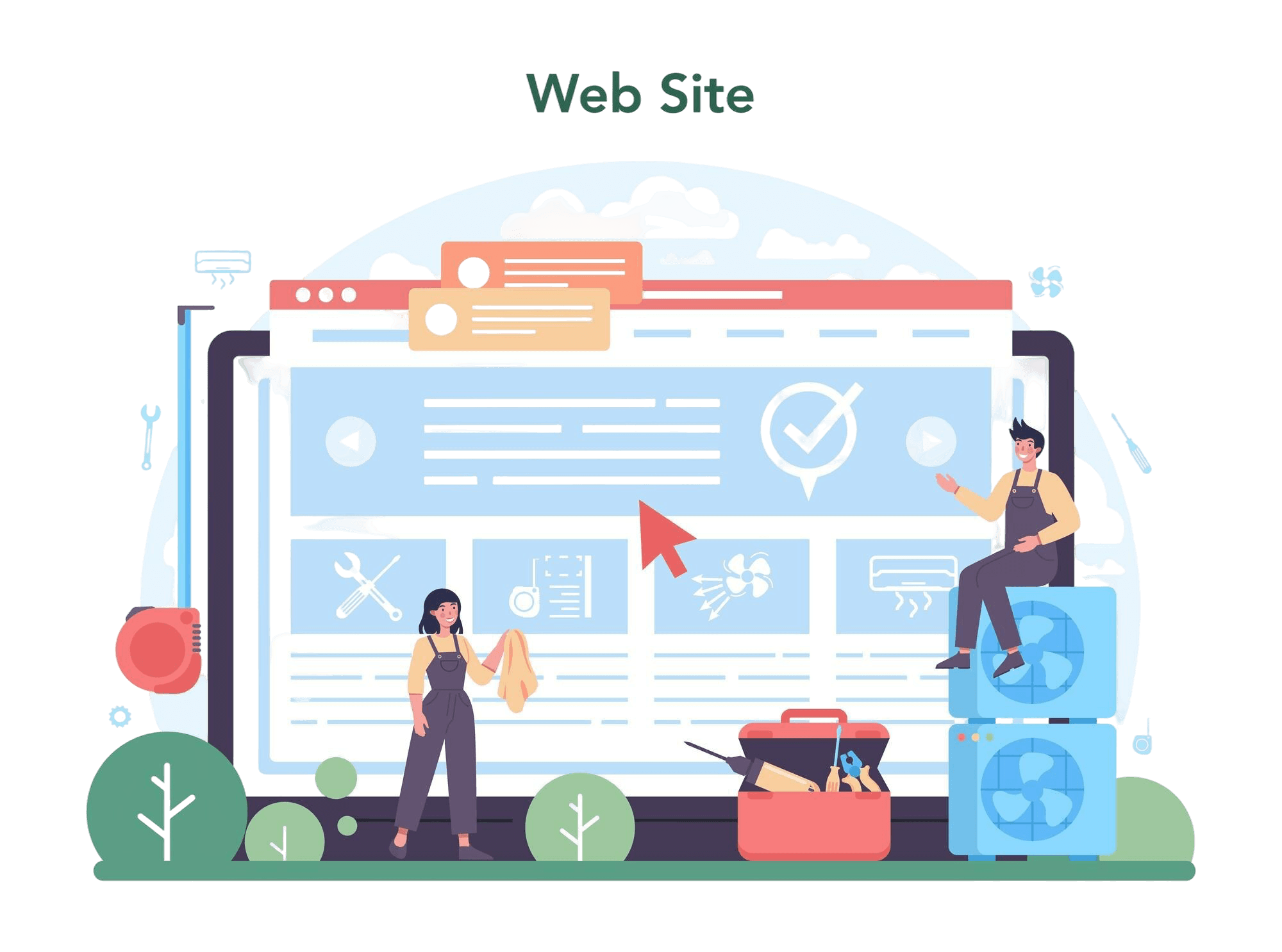
Using Subpages to Build Service, Pricing, and About Pages
As your website grows, placing all your information on a single page becomes less effective. Visitors want to ...
Why Every Artist Needs a Website Beyond Social Media
For artists, musicians, photographers, illustrators, and other creatives, social media has become an important...
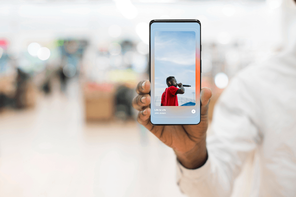
Selling Digital Products with ME-Page: What You Need
The digital economy has opened countless opportunities for creators, freelancers, educators, and entrepreneurs...
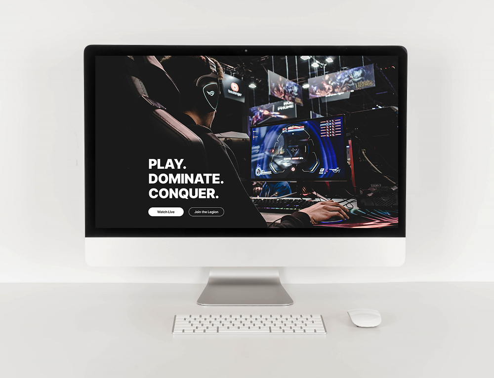
Community Websites for Gamers: Features That Matter
Gaming is no longer just about playing—it’s about connecting with people who share the same interests. Whether...

How Community Projects Use ME-Page to Grow Awareness
Community initiatives, local organizations, volunteer groups, and nonprofit projects often face the same chall...

How Startups Launch MVP Websites with ME-Page
For startups, speed is everything. Before investing heavily in development, design, or marketing, founders nee...
Most Popular Articles


Recent Articles
Everything You Need to Know About Using ME-Page Constructor for Your Website.
Using Subpages to Build Service, Pricing, and About Pages
As your website grows, placing all your information on a single page becomes less effective. Visitors want to ...
Why Every Artist Needs a Website Beyond Social Media
For artists, musicians, photographers, illustrators, and other creatives, social media has become an important...
Selling Digital Products with ME-Page: What You Need
The digital economy has opened countless opportunities for creators, freelancers, educators, and entrepreneurs...
Community Websites for Gamers: Features That Matter
Gaming is no longer just about playing—it’s about connecting with people who share the same interests. Whether...
How Community Projects Use ME-Page to Grow Awareness
Community initiatives, local organizations, volunteer groups, and nonprofit projects often face the same chall...
How Startups Launch MVP Websites with ME-Page
For startups, speed is everything. Before investing heavily in development, design, or marketing, founders nee...