Me-Page Team
Last modified 17 Nov 2025
Article Plan
- 1. Overloading Your Page with Too Much Content
- 2. Using Poor or Inconsistent Typography
- 3. Choosing the Wrong Colors
- 4. Ignoring Mobile Optimization
- 5. Weak or Missing Calls-to-Action (CTAs)
- 6. Using Low-Quality Images or Too Many Visuals
- 7. Ignoring Simplicity and Overcomplicating the Layout
- Final Thoughts: Great Design Comes from Clarity, Not Complexity
Creating a website is exciting—you get to shape how the world sees your brand, project, or personal page. But even with great tools like ME-Page, a few design mistakes can hold your site back. The good news? They’re easy to avoid once you know what to look for.
Here are the 7 most common website design mistakes, along with simple, practical tips to help you create a clean, modern, and user-friendly site in 2025.

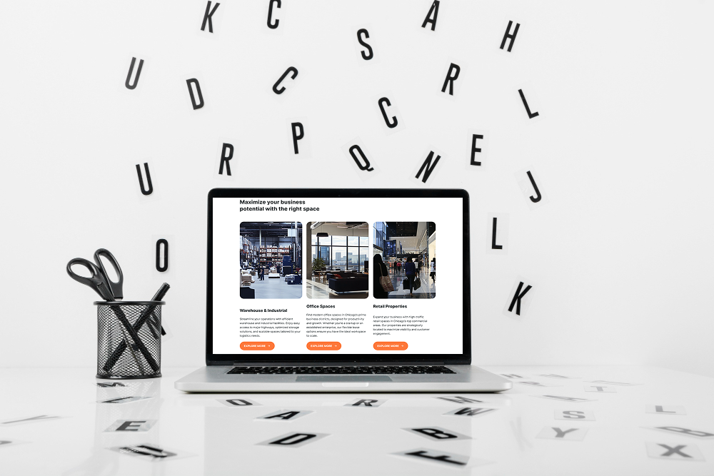
1. Overloading Your Page with Too Much Content
One of the biggest common web design errors is trying to squeeze everything onto a single page - too much text, too many images, or too many blocks. This overwhelms visitors and makes them leave quickly.
How to avoid it:
- Keep sections short and focused.
- Highlight only the most important information.
- Use headings, spacing, and visual breaks to make content easy to scan.
Remember: clarity beats clutter.
2. Using Poor or Inconsistent Typography
Your text is the main way you communicate, so typography matters. Mixing too many fonts, using unreadable sizes, or choosing colors with low contrast can ruin an otherwise great design.
Avoid bad design by:
- Sticking to 1–2 main fonts.
- Using clear sizes for titles, subtitles, and body text.
- Ensuring your text color stands out from the background.
ME-Page templates already follow modern typography rules, so you can start strong and adjust only where needed.
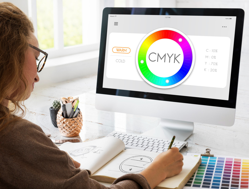
3. Choosing the Wrong Colors
Color is powerful—it sets mood, builds brand identity, and guides attention. But colors used incorrectly can make your site look unprofessional, chaotic, or hard to read.
Common mistakes include:
- Using too many bold colors at once
- Poor contrast between text and background
- Unbalanced or unharmonious color combinations
How to fix it:
Pick one main brand color, one accent color, and one neutral. ME-Page’s color settings make it easy to apply them consistently across your site.4. Ignoring Mobile Optimization
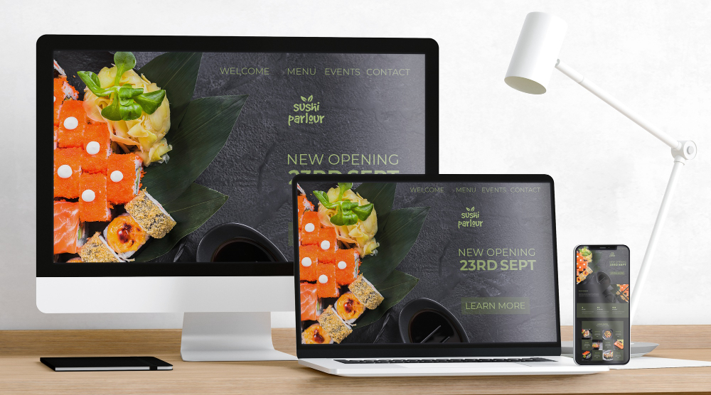
More than half of all website traffic comes from mobile devices. A site that looks great on desktop but broken on phones is a major turn-off.
Avoid this 2025 design mistake by:
- Previewing your page on mobile while editing in ME-Page
- Keeping headings short so they don’t wrap awkwardly
- Using sections that stack naturally on small screens
ME-Page automatically adjusts your layout for all devices—but reviewing it yourself ensures the final look is perfect.
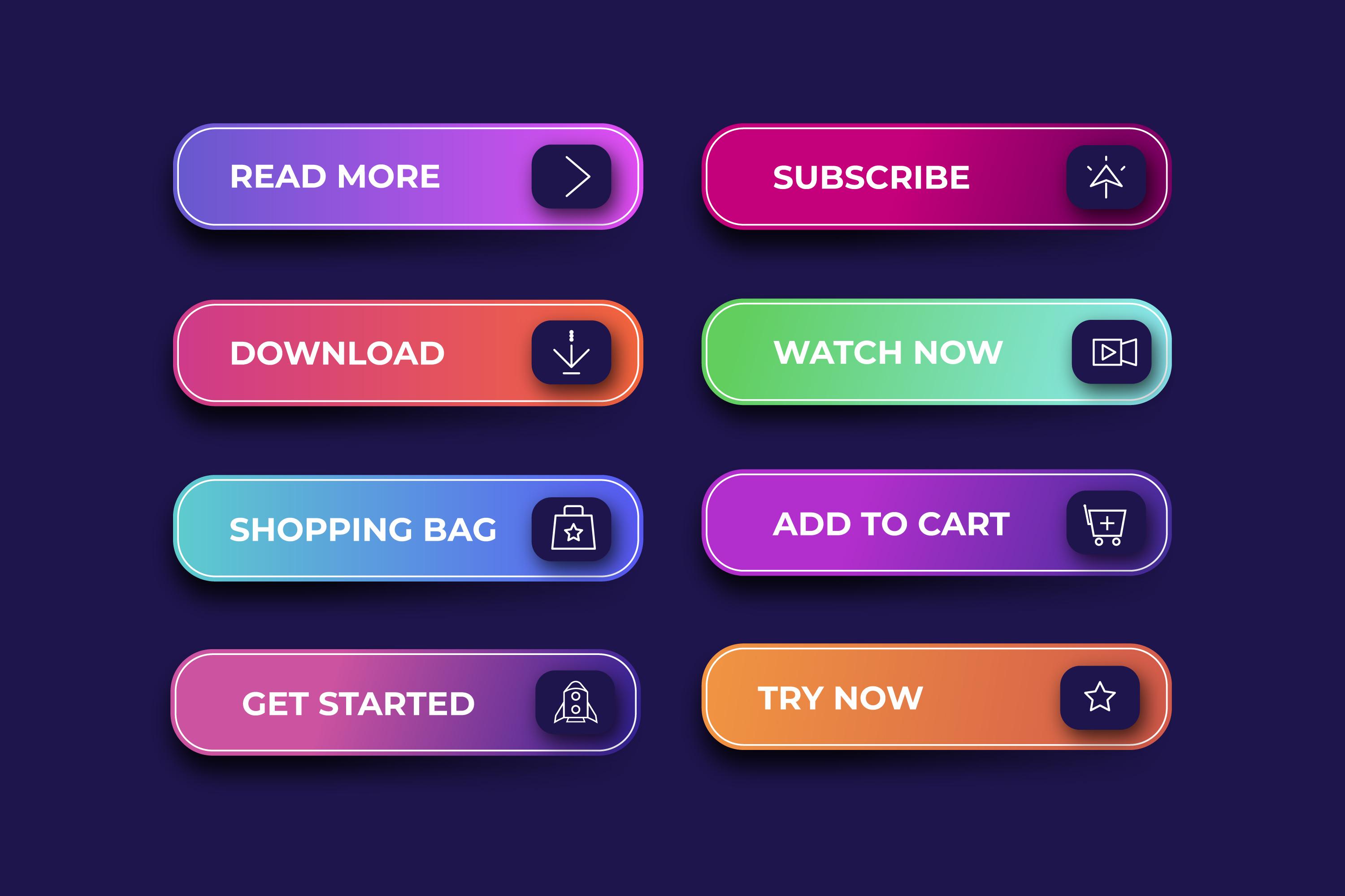
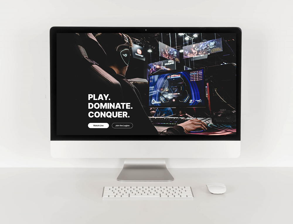
5. Weak or Missing Calls-to-Action (CTAs)
Visitors should instantly know what to do next—contact you, book a service, view your portfolio, or follow your socials. A website without clear CTAs feels unfinished and confusing.
CTA mistakes to avoid:
- Buttons that blend into the background
- Vague wording like “Click Here”
- Placing the only CTA at the bottom of the page
Better approach:
Use clear, strong commands like:
- “Book Now”
- “View My Work”
- “Get Started”
And place CTAs in banners, key sections, and at the end of the page.
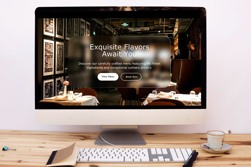
6. Using Low-Quality Images or Too Many Visuals
Images make your site visually engaging—but low-resolution photos or random visuals can destroy its professional look. On the other hand, too many images slow down loading and distract visitors.
How to avoid this:
- Use high-quality, compressed images.
- Stick to a consistent style—colors, tone, or theme.
- Choose visuals that support your message, not distract from it.
ME-Page’s image blocks make it easy to upload and preview photos so you can maintain a clean aesthetic.


7. Ignoring Simplicity and Overcomplicating the Layout
Trying to impress visitors with too many animations, unusual layouts, or overly creative designs often backfires. Simplicity is timeless—and in 2025, clean design is more popular than ever.
Avoid these layout mistakes:
- Random block placements
- Uneven spacing
- Too many fonts, colors, or icons
Website design tip:
Use ME-Page’s pre-designed sections as a foundation. They follow modern design principles, balanced spacing, and clean structure—perfect for beginners and pros alike
Final Thoughts: Great Design Comes from Clarity, Not Complexity
Avoiding these website design mistakes is the fastest way to create a polished, modern, and user-friendly site. Whether you’re new to building websites or simply upgrading your online presence, focusing on clean visuals, simple structure, and clear messaging will set you up for success.
ME-Page makes this easier than ever with templates, banners, sections, and easy customization tools made for beginners and creators alike.
Build smart. Keep it simple. And let your website shine.
Was This Article Helpful?
Click on a star to rate it!
Average Rating: 5/5
Voutes: 1
Share with Friends:
Previous
How to Highlight Key Information with Banners and Sections on ME-Page

Next
How to Use Color Palettes and Fonts for a Professional Website Look
Recent Articles
Everything You Need to Know About Using ME-Page Constructor for Your Website.
Using Subpages to Build Service, Pricing, and About Pages
As your website grows, placing all your information on a single page becomes less effective. Visitors want to ...

Why Every Artist Needs a Website Beyond Social Media
For artists, musicians, photographers, illustrators, and other creatives, social media has become an important...

Selling Digital Products with ME-Page: What You Need
The digital economy has opened countless opportunities for creators, freelancers, educators, and entrepreneurs...
Community Websites for Gamers: Features That Matter
Gaming is no longer just about playing—it’s about connecting with people who share the same interests. Whether...

How Community Projects Use ME-Page to Grow Awareness
Community initiatives, local organizations, volunteer groups, and nonprofit projects often face the same chall...

How Startups Launch MVP Websites with ME-Page
For startups, speed is everything. Before investing heavily in development, design, or marketing, founders nee...
Using Subpages to Build Service, Pricing, and About Pages
As your website grows, placing all your information on a single page becomes less effective. Visitors want to ...
Why Every Artist Needs a Website Beyond Social Media
For artists, musicians, photographers, illustrators, and other creatives, social media has become an important...
Selling Digital Products with ME-Page: What You Need
The digital economy has opened countless opportunities for creators, freelancers, educators, and entrepreneurs...
Community Websites for Gamers: Features That Matter
Gaming is no longer just about playing—it’s about connecting with people who share the same interests. Whether...
How Community Projects Use ME-Page to Grow Awareness
Community initiatives, local organizations, volunteer groups, and nonprofit projects often face the same chall...
How Startups Launch MVP Websites with ME-Page
For startups, speed is everything. Before investing heavily in development, design, or marketing, founders nee...