Me-Page Team
Last modified 14 Nov 2025
Every great website has one thing in common—it communicates clearly. Visitors shouldn’t have to search for important details or wonder what action to take next. With ME-Page, you can easily guide your audience’s attention using banners and sections that highlight your key information in style. Whether it’s an announcement, a product feature, or a contact button, banners and sections help you make your content pop.
In this guide, we’ll explore how to highlight info on your website, how to use banners in ME-Page, and some of the best call-to-action design website tips to turn visitors into active users.
Why Highlighting Information Matters on a Website
Imagine walking into a store with no signs or labels—you’d probably feel lost. The same happens when a website doesn’t emphasize its key messages. Visitors quickly lose interest if they can’t see what’s important right away.
Highlighting essential details helps you:
- Direct attention to what truly matters (offers, services, or updates).
- Improve readability by breaking large chunks of text into clear, visual sections.
- Encourage action—like clicking “Buy Now,” “Subscribe,” or “Contact Us.”
On ME-Page, banners and sections make this process effortless. You can transform your ideas into visually appealing layouts that naturally draw visitors’ eyes where you want them.
Using Banners to Grab Attention
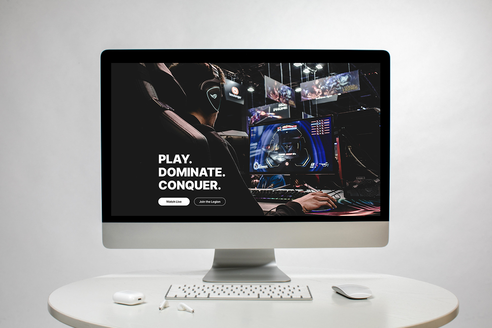
What Makes a Good Website Banner
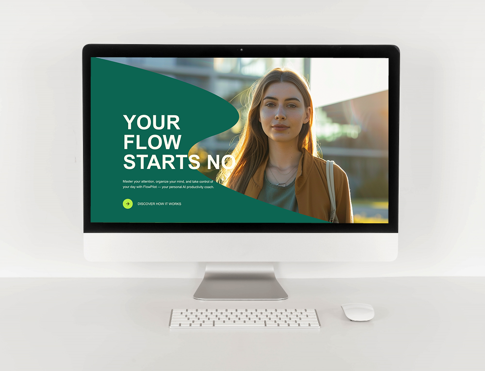
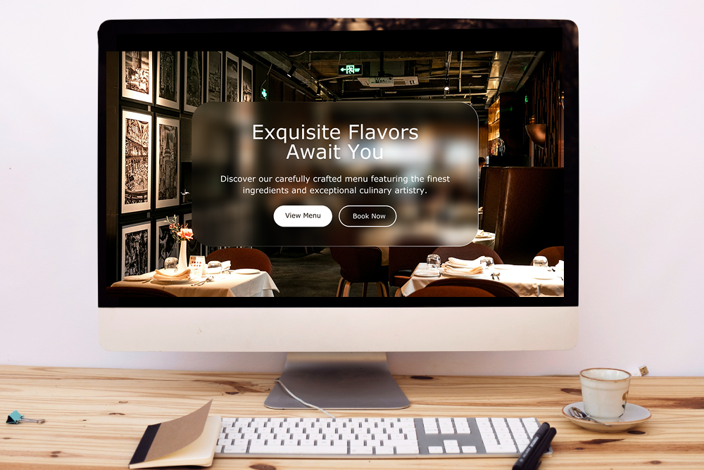
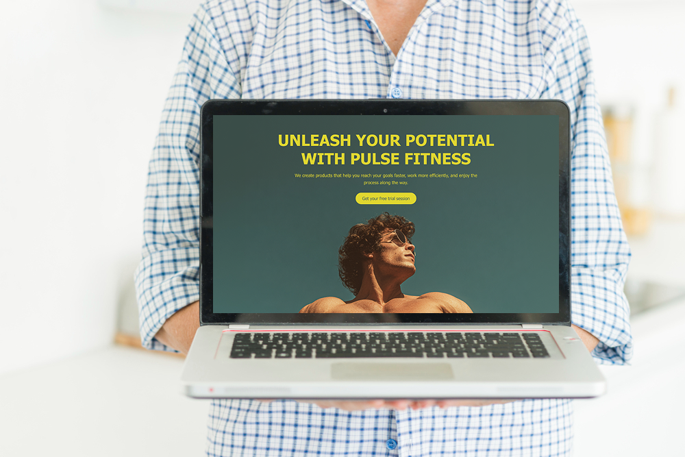
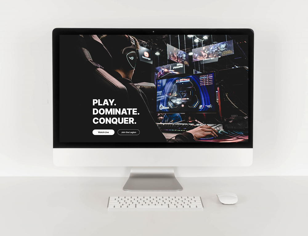
A banner acts as a spotlight for your content—it’s what visitors notice first. A good banner is clear, simple, and visually aligned with your brand. It can include:
- A bold headline that communicates your main message.
- A background image or color that complements your design.
- A call-to-action button to guide the next step.
For example, you might use a banner to announce a sale, highlight a new service, or introduce yourself. The goal is to make your message stand out instantly.
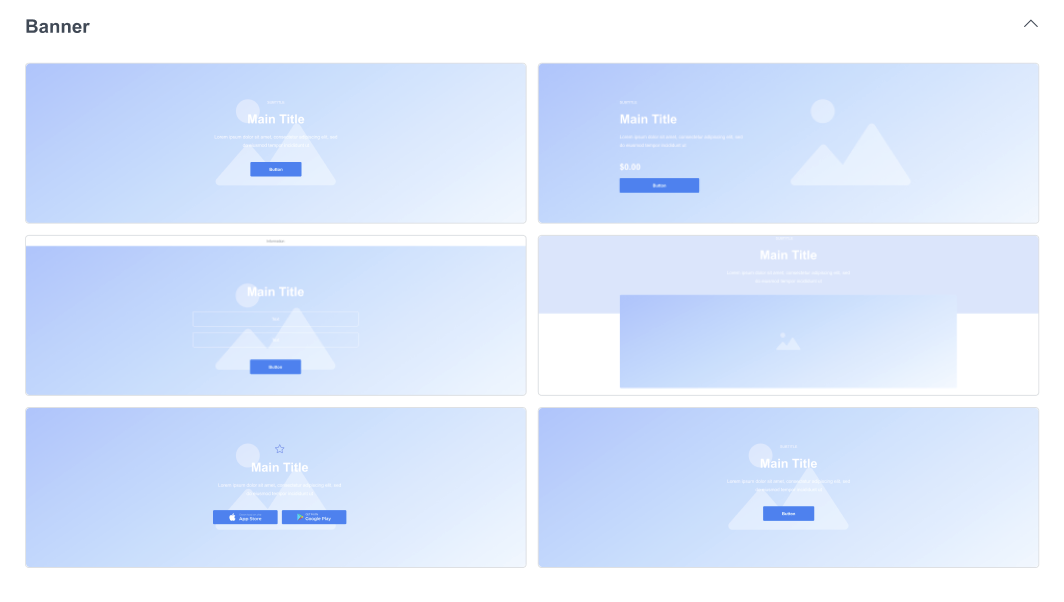
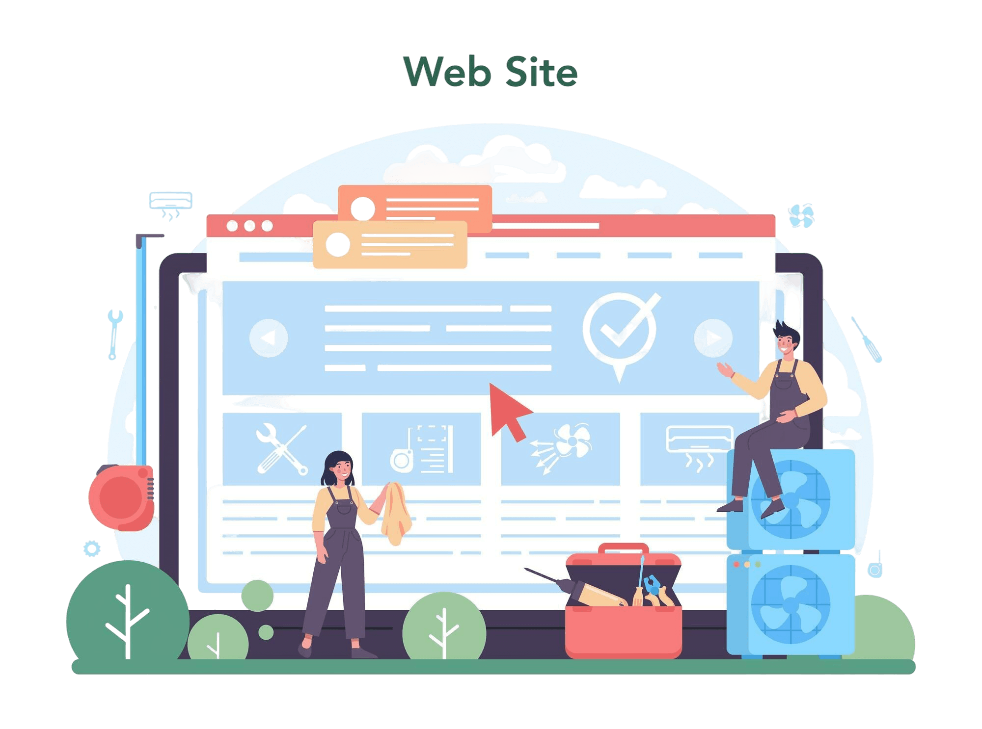
How to Use Banners in ME-Page
ME-Page makes banner creation intuitive and flexible. When you build your site:
- Add a Banner Block – Choose from the available pre-made banner designs.
- Customize Your Text and Buttons – Edit the heading, subheading, and CTA button to match your message.
- Adjust Background and Colors – Change the background color, image, or gradient to fit your brand identity.
- Preview Instantly – See your changes live before publishing.
Want to update an announcement? Just edit the banner directly—it takes seconds. You don’t need coding skills or complex tools. It’s all about clear design and easy customization.
Organizing Content with Sections
Structuring Your Page for Easy Reading
When you create sections in ME-Page:
- Start with a clear flow — for example, introduction → services → testimonials → contact.
- Use headings and spacing to separate different ideas.
- Add visuals like images, icons, or videos to keep things engaging.
Sections are especially useful for longer pages. Instead of overwhelming visitors with too much text, you can present information in digestible parts—each with its own focus.
Adding Visual Flow Between Sections
ME-Page templates include smooth transitions between sections, so your page feels cohesive and natural. You can:
- Alternate background colors for contrast.
- Add dividers or subtle animations to create rhythm.
- Use consistent typography to tie everything together.
This not only enhances readability but also gives your website a polished, professional look.
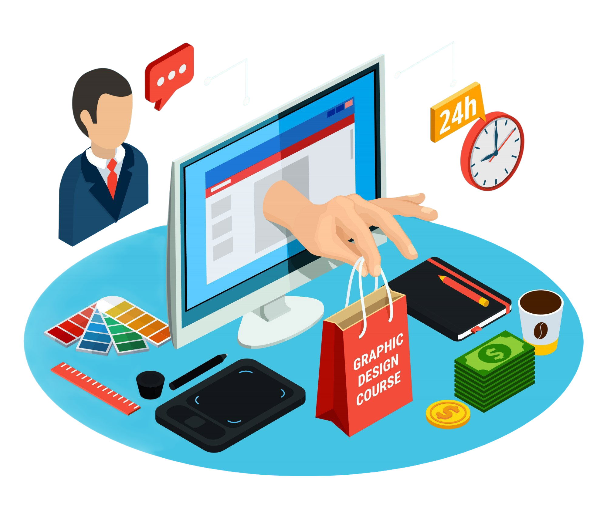
Tips for Effective Calls-to-Action (CTAs)
Highlighting information isn’t just about visuals—it’s also about prompting visitors to take action. That’s where CTAs (calls-to-action) come in. These are buttons or links that lead visitors to do something specific—like “Get Started,” “Book Now,” or “Read More."
Where to Place CTAs for Maximum Impact
Placement matters. Here are some banner section tips to improve conversions:
- Include a CTA in your banner section, right after your headline.
- Add a second CTA near the bottom of the page, where users decide what to do next.
- Use contrasting colors to make buttons stand out, but keep them consistent with your design style.
A visitor should never have to scroll too far to find what to do next.
Keep It Clear and Simple
Your CTA text should be short and action-oriented. Instead of vague phrases like “Click Here,” use specific ones like:
- “View My Portfolio”
- “Join the Newsletter”
- “Download Free Guide”
This clarity increases engagement and helps users instantly understand the value of clicking.
Final Thoughts: Make Your Page Stand Out with Banners and Sections
Your website is your digital voice—and how you present your information matters. With ME-Page, you can easily highlight info on your website using banners and structured sections that communicate clearly, look professional, and guide visitors toward action.
Whether you’re showcasing a service, promoting an event, or introducing yourself, banners help you shine while sections keep everything organized and readable. Combine the two, and you’ll create a natural flow that captures attention and holds it.
So, take advantage of the intuitive ME-Page editor. Experiment with banner designs, play with layouts, and craft sections that tell your story beautifully.
In just a few clicks, you can turn a simple page into a visually engaging website that stands out—and inspires visitors to take action.
Was This Article Helpful?
Click on a star to rate it!
Average Rating: 5/5
Voutes: 1
Share with Friends:

Previous
How ME-Page Ensures Website Security with HTTPS and Safe Hosting

Next
7 Design Mistakes to Avoid When Building a Website
Recent Articles
Everything You Need to Know About Using ME-Page Constructor for Your Website.
Using Subpages to Build Service, Pricing, and About Pages
As your website grows, placing all your information on a single page becomes less effective. Visitors want to ...
Why Every Artist Needs a Website Beyond Social Media
For artists, musicians, photographers, illustrators, and other creatives, social media has become an important...
Selling Digital Products with ME-Page: What You Need
The digital economy has opened countless opportunities for creators, freelancers, educators, and entrepreneurs...
Community Websites for Gamers: Features That Matter
Gaming is no longer just about playing—it’s about connecting with people who share the same interests. Whether...

How Community Projects Use ME-Page to Grow Awareness
Community initiatives, local organizations, volunteer groups, and nonprofit projects often face the same chall...

How Startups Launch MVP Websites with ME-Page
For startups, speed is everything. Before investing heavily in development, design, or marketing, founders nee...
Using Subpages to Build Service, Pricing, and About Pages
As your website grows, placing all your information on a single page becomes less effective. Visitors want to ...
Why Every Artist Needs a Website Beyond Social Media
For artists, musicians, photographers, illustrators, and other creatives, social media has become an important...
Selling Digital Products with ME-Page: What You Need
The digital economy has opened countless opportunities for creators, freelancers, educators, and entrepreneurs...
Community Websites for Gamers: Features That Matter
Gaming is no longer just about playing—it’s about connecting with people who share the same interests. Whether...
How Community Projects Use ME-Page to Grow Awareness
Community initiatives, local organizations, volunteer groups, and nonprofit projects often face the same chall...
How Startups Launch MVP Websites with ME-Page
For startups, speed is everything. Before investing heavily in development, design, or marketing, founders nee...